20

In the spirit of addressing the beta's Top 7 issues, I thought I'd launch this thread where we can discuss what we want for JLU's logo and hopefully prompt the more artistic-minded among us to post their graphic contributions.

Maybe first, it would be useful to define some general guidelines on what we want and don't want (or is that too "design by committee"?)...

For example:

Overall mood/雰囲気(hunn-iki) New! (See comments to this question)

  • What kind of look will best capture the purpose and spirit of the site? It can be in words or images.
  • What do we want it not to look like?

Design elements

  • Do we want to any text in it (e.g. "JLU")?
  • Do we use kanji (e.g. "日本語"...)?
  • Illustrations (e.g. cheesy but typical Hokusai background) or figurative only?
  • What about a hinomaru? Too loaded? (Japanese people themselves tend to not be overly fond of its use in public forums)

etc. etc.

Please post any thought you have on this and/or mock-ups if you feel like giving it a try. Although I am no graphic designer, I'll be happy to take a stab at it, to open the way, but would love to hear some opinions first...

10
  • 1
    thank you for starting this design conversation early! I like a lot of the logo suggestions so far. As far as the overall design, I think it's best to focus on a "mood" we want to capture. Implementation of specific details aren't too important right now. I'd go for a tranquil and more Zen look.
    – Jin
    Commented Jun 22, 2011 at 8:55
  • @Jin, thanks for joining the conversation! Re. details vs. mood, I think that's the general idea with picking a logo (it would naturally guide the rest of the design). Let's see what people suggest, but I think so far a "tranquil" look is a given (nobody wants blazing anime characters on a 500px banner)... As for 'zen', it might be a little more delicate to define, since a few people (myself at least) would probably be weary of the whole "mystic orient" cliché issue... ;-) But i'm sure it can be worked out...
    – Dave
    Commented Jun 22, 2011 at 15:03
  • @Dave what we can't use Gundams? :) maybe using the term "Zen" was redundant with "Tranquil." I definitely didn't mean it in that cliché way.
    – Jin
    Commented Jun 22, 2011 at 15:30
  • How about opening a new sub-question to poll on which adjectives best describe how JLU should look like? It can run in parallel with this discussion about what elements we'd like to have in the design.
    – ento
    Commented Jun 22, 2011 at 18:07
  • @ento: sure... although perhaps there is no need to spread ourselves too thin on that one, and we can just use this current question. I think by now the above is a CW, so feel free to edit accordingly!
    – Dave
    Commented Jun 23, 2011 at 5:48
  • @Dave: True. I took a stab at adding in some words about the issue of mood. No ninja edit intended!
    – ento
    Commented Jun 24, 2011 at 6:19
  • Some of my (multiple) answers were talking about the whole look/visual theme of the site rather than just the logo as asked in the question. I'm deleting those now that I realize and after getting some downvotes. But it seems some other answers/comments have blurred the two as well. Commented Jun 25, 2011 at 14:38
  • @hippietrail I was behind some of the downvotes. Note that on meta (unlike the main site), downvotes don't mean that your answers were bad -- it means that the downvoter disagreed with your proposal. (meta.stackexchange.com/questions/93758/…). I certainly thought your answers were valid; I just don't want red and white to be part of the color theme, and used a downvote to express that. :)
    – Amanda S Mod
    Commented Jun 25, 2011 at 18:59
  • @Amanda: Do you think I should undelete those answers then or reserve that for the discussion of the overall theme and colour scheme? Commented Jun 27, 2011 at 13:46
  • Considering the charged political under (and over)tones of the hinomaru, I think it would be good to leave that out. Commented Feb 26, 2013 at 10:42

14 Answers 14

27

Unmistakably Japanese

A pet peeve of mine is chimeras of oriental symbols and elements being presented as oh so Japanese. Even with personal feelings aside, the logo should be easily recognizable as something about genuinely Japanese.

To this end, I suggest using hiragana as much as kanji. Japanese is the only language that uses hiragana, and it will help distinguish JLU from the upcoming Chinese Language & Usage if they ever use kanji in its logo.

standalone あ

あ in real life

Real world usage: えそら.cc (esora.cc), a Q&A site providing human translation for Japanese and English, also uses hiragana in its logo.

To further develop what Japanese-ness about, I say the logo/banner should be modest, with care for the small and beautiful details.

I always liked how the English Language & Usage site carries the feeling of good old literature in an undertone and its sparse yet effective use of curlicues. (Surprisingly?) this is in line with how I think about what a Japanese touch is.

Additionally, Ōkami the game is a great work of visual art that recreates the ancient times of Japan. I think it'll be overkill if you blindly pull in all the elements, but it's a good source of inspiration.

Traditional Japanese colors

How about choosing the color palette from the traditional colors of Japan. They give a good selection of subdued, modest looking colors and also vivid and elegant ones.

Amanda's example images show how these colors are used.

6
  • 4
    I like the suggestion that this community will one day top StackOverflow :)
    – Amanda S Mod
    Commented Jun 24, 2011 at 21:54
  • 1
    Very good point and ideas! I do like the concept of a single kana as the logo. The small version in particular seems to fit very well. I am less sure about how it would look as the full size logo in the masthead (might be a little too bare). 100% with you on trying to emulate the classy and sparse design of ELU and on using "traditional colours of Japan" (though to be fair, they are mostly names on a palette that covers nearly every colour we could think of ;-).
    – Dave Mod
    Commented Jun 26, 2011 at 2:57
  • Excellent points, especially the one about the Hiragana vs Kanji usage.
    – Jin
    Commented Jun 26, 2011 at 3:15
  • 4
    One caveat: the hiragana are not just pretty symbols, they have meaning in the language. I'm afraid that this logo is going to as weird to a Japanese person as using a simple letter "A" as a logo would look to an English speaker. I'm not against using hiragana or katakana, but could we either pick one that has some meaning related to our site, or stylize it to the point where it's unmistakably a logo?
    – Amanda S Mod
    Commented Jun 27, 2011 at 18:30
  • Love the traditional colors of Japan, though!
    – Amanda S Mod
    Commented Jun 27, 2011 at 18:30
  • Thanks for the positive comments! @Dave, @Amanda: I posted a separate answer so the discussion about the single-letter hiragana can be continued there. (I deliberately narrowed down the suggestion to the square icons. I don't think it works as a masthead either.)
    – ento
    Commented Jun 30, 2011 at 14:54
20

Vote up if you are against the use of faux-Oriental style English script as part of the website styling.

3
  • It confuses the hell out of me when I can't tell at first glance if something's meant to be read in English or Japanese (like the Excel Saga logo)
    – Amanda S Mod
    Commented Jun 25, 2011 at 6:30
  • Well it depends how kanji-ish it gets I suppose. I thought many people would just find it cheesy. But then again it's enduring popularity might make it a contender so I allowed for both (-: Commented Jun 25, 2011 at 6:32
  • 2
    Good idea (the whole single-simple-question style). And definitely against faux-kana romaji... Not that I find it particularly confusing, but really, what would be the point (it's both cheesy and a poor man's excuse for the real deal, so we might as well have real kanji if anything).
    – Dave Mod
    Commented Jun 25, 2011 at 8:16
11

What about incorporating patterns from chiyogami or yuuzen? That way we avoid clichéd symbols while still giving the site a very Japanese feel.

Examples:

chiyogami yuuzen

The site background could be a more subtle white/off-white paper pattern, like this:

kouzogami

4
  • heh, one wo/man's art is another wo/man's art. And vice versa ;-) But I am all in favour of using some nice Japanese patterns in the site's design. Though personally, I'd keep them off the logo and banner: even the most harmless wallpaper will start feeling really annoying when it is a) covering the whole masthead b) displayed with every page load... One way to use these which could look really cool, would be as a very thin stripe under the banner, or elsewhere in the page theme...
    – Dave
    Commented Jun 21, 2011 at 18:29
  • @Dave Yeah, I agree with you that it should be understated. I wasn't thinking of covering the whole page, just the banner or part of the banner. Though if we wanted to continue with the paper theme, we could go with a subtle white/off-white pattern for the page background, like these papers...
    – Amanda S
    Commented Jun 21, 2011 at 18:55
  • just realised that my above comment had a typo that made it completely nonsensical (if very zen-like ;-). I meant of course: "one wo/man's art is another wo/man's cliché"
    – Dave
    Commented Jun 22, 2011 at 15:05
  • If we're also talking about the site's background, maybe changing the current muted graph paper pattern to a similarly muted Kanji writing worksheet pattern can be a nice touch.
    – Oren Ronen
    Commented Jun 23, 2011 at 13:30
10

Icon suggestion

Use a single Hiragana as the site icon.

Example: medium icon:

medium icon

..as seen on StackExchange - All Network Sites.

Example: small icon:

small icon

..as seen on StackExchange - Top Network Sites (see the right-hand column).

Letter candidates:

    • pros: hopefully easily recognizable, as being the first letter of hiragana.
    • cons:
    • pros: looks cool
    • cons: archaic
    • pros: resembles a J (for "Japanese" in some fonts)
    • cons:
3
  • 4
    I like あ as icon. I do not like ふ because “resembles a J” does not really sound like a pro. ゑ should be used in a website about classical Japanese. Commented Sep 29, 2011 at 20:34
  • 2
    If you're going to create a grid behind the letter, may I recommend using the 4-square grid that Japanese students use to practice writing rather than the 9-square grid you have now? If you wanted to be extra spiffy, you could add the stroke order like a Japanese 1st grader would use to indicate order and direction of each stroke.
    – jmac
    Commented Aug 6, 2013 at 6:29
  • 1
    I've always believed that を would be the best letter to symbolize the crucial aspect of Japanese usage (and it looks a bit like an ampersand, isn't it?). Commented Jun 9, 2015 at 18:53
7

The other answers to this question are okay, I guess. However, all of them (except one) have a common problem: There aren't any bunnies in them.

Unless I'm very much mistaken, the full name of this Stack Exchange site is "Japanese Language and Usagi" (i.e. bunny rabbits), yet only four results are found when I search for ウサギ on the main JLU site (and one of those is simply an answer to another result).

This anti-rabbit bias is also evident here on Meta; Questioner attempted to redress the balance with a very nice, rabbit-inclusive logo suggestion, only to be met with excuses like "I'm not entirely sure it would work as a general logo" and "a small version would be unrecognisable". Excuses, excuses - admit it, you just don't like fluffy bunny rabbits.

Well, I'm not standing for it. As far as I'm concerned, any potential logo suggestions should include both Japanese Language and Usagi, in order to be fully representative of what this site is all about. I'm no artist, but I've attempted to create something that I think covers both aspects equally:

image

Given that the favicon image needs to be 16x16 pixels in size, I've also had a go at creating a pixel-art version:

favicon

0
6

What about the ※ symbol? It's clean, simple, Japanese, and is used to mark helpful information.

Edit: A couple of mockups (imagine whatever color scheme you like):

a large komejirushi symbol on the left, with "Japanese Language and Usage" on three lines to the right of it

a smallish komejirushi symbol on the left, with "Japanese Language and Usage" on one line to the right of it

3
  • Nice idea! Now anybody up for the task of making it into a logo? :-)
    – Dave
    Commented Jun 22, 2011 at 4:53
  • 1
    I am not sure that typography rules let you start a line with an ampersand. And I think the misalignment of the third line is problematic. I prefer the banner version.
    – Axioplase
    Commented Jun 24, 2011 at 4:30
  • 5
    I like the simpleness, but.. I can't help interpreting the symbol as "addendum"/"nota bene"/"not the main content", rather than about being helpful. Think of it as analogous to using the dagger symbol in the logo of EL&U: "† English Language & Usage". Just my 2 yens..
    – ento
    Commented Jun 24, 2011 at 6:32
5

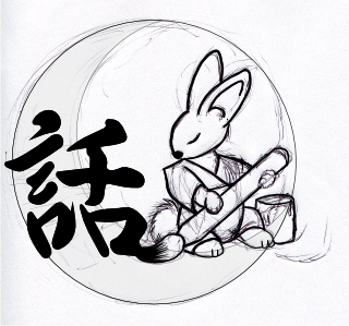
How about something with a moon bunny?

I don't know why... I just like moon bunnies. And I'm just trying to brainstorm about something outside of the usual hinomaru, Mount Fuji, and sakura schtick, but still with a Japanese reference.

(I know the whole moon bunny thing is also in Chinese and Korean cultures, but I don't think in such a way that evoke reference to those cultures moreso than Japan.)

Moon Bunny

2
  • This just makes me think of apple bunnies...
    – Amanda S
    Commented Jun 23, 2011 at 5:17
  • 6
    I really love the illustration! However, I am not entirely sure it would work as a general logo for the site (if only because a small version would be unrecognisable). Perhaps it is a good direction for the banner (if we have one), though... A separate concern, is that it might put too much emphasis on the culture aspect, when we want to make it clear that we are a language(-and-language-related-culture) site.
    – Dave
    Commented Jun 23, 2011 at 5:46
4

Another idea: if people like the look of the current site, what about something that looks like genkou youshi for the background? The Japanese name of the site could even be written down the right-hand side.

4
  • I think it will be a lot easier to pick a background (either genko youshi or typical japanese off-white Japanese letter paper, as you suggested before), when we have picked a logo. Using the logo's style and colours as a guide to coordinate the rest is a good way to ensure we don't end up with a patchwork of "japan-like" themes that are nice taken individually, but a bit heavy put all side-by-side... What do you think?
    – Dave
    Commented Jun 22, 2011 at 0:46
  • @Dave I admit that I misread the question and thought we were talking about the general look of the site. That said, SE site design seems to be trending away from a single logo (a la StackOverflow) and toward a more unified look with a banner across the top (like Latex, Cooking, or English). I admit to being pretty partial to the latter design.
    – Amanda S
    Commented Jun 22, 2011 at 1:27
  • no worries. As I said they go together. I didn't mean to say we should only do a logo. Just that, in terms of picking a harmonious theme for the entire design, going with first the logo/banner is a good approach, imo. Logo design concentrates nearly all the issues that need to be sorted out for the general design (colours, theme etc)...
    – Dave
    Commented Jun 22, 2011 at 3:01
  • To give an example of what I mean: paper with a classroom feel will go well with our current "beta-style" logo, or maybe even with the inkan-style logo last made by @Derek... But with a different banner (say some typical Japanese-style illustration), a more subdued, uniform, background would probably be a better idea. Hence, rather than spend too much time deciding each part separately and end up with incompatible choices, I figured we could all focus on the logo and, once we have a consensus on that, picking the rest should be much easier...
    – Dave
    Commented Jun 22, 2011 at 3:04
4

I was playing around in Inkscape over lunch today and came up with this:

Japanese Language & Usage logo proposal

Kind of going for the simple, abstract style you see on prefectural and municipal flags. Too abstract, maybe?

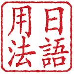
EDIT: Another quick sketch, this time going for an inkan style with 日語用法 for "Japanese Language & Usage" (replacement kanji welcomed).

Japanese Language & Usage logo proposal 2

Slightly bolder font:

Japanese Language & Usage logo proposal 3

9
  • 1
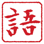
    It looks very spiffy, @Derek, but is there any meaning? Or just going for a fun abstract shape? ;-) I do think the logo should bear some connection to the group's topic. But perhaps something along that line, with actual kanji (e.g. 語 in seal script)... Basically kinda like an inkan? Might be nice...
    – Dave
    Commented Jun 21, 2011 at 18:23
  • @Dave: Well it was supposed to be a stylized "JLU"…or something along those lines. :D I considered an inkan style too, but wasn't sure which kanji to go with, much less how to get them to all fit nicely. Commented Jun 21, 2011 at 18:36
  • @Derek: oh, I see! Sorry, I was just being lazy (it's quite late here) and figured I'd ask before even straining my eyes... In that case, it's quite cool (though definitely need to know it's there to see it). I've also been giving some thought to what single kanji would be a good fit for a logo design... So far, I think 語 would be the best... First, because other more obvious candidates (漢、字、日、本)all either have a meaning that is either too specific (only kanji) or too vague (all of Japan), but also because it's quite a nice illustrative meaning ("5 mouths that speak are a language")...
    – Dave
    Commented Jun 21, 2011 at 18:39
  • Of course, 和 would be another good candidate...
    – Dave
    Commented Jun 21, 2011 at 18:41
  • 1
    @Dave: I agree 語 is probably best if you're going for a single kanji. I'm wondering if you could break it out into four so it fits nicely in a square inkan (see second image). Commented Jun 21, 2011 at 19:00
  • @derek: I really like the overall feel of the second batch! Personally, i'd go for the ones on the right (red on white). Not sure how "日語" works (looks a bit strange to me, but only a native could say if it's acceptable in this context). But, with a bit of fine-tuning on the font and kerning, that style would do a great logo imho. We also need to see how it looks at a much smaller size (like the kind used in the list of SE sites). Maybe make it a one-kanji inkan for the small-size version (if 4 kanji is not readable).
    – Dave
    Commented Jun 22, 2011 at 0:42
  • 1
    I should have mentioned earlier, but I posted a question on the main site that is relevant to this: japanese.stackexchange.com/questions/1402/… - The gist of it is that 日語 is probably not a good idea... and none of the possible 2-char replacements are very convincing... Not sure what's best then...
    – Dave
    Commented Jun 22, 2011 at 12:59
  • I kinda like all of the designs here. :)
    – Boaz Yaniv
    Commented Jun 22, 2011 at 22:59
  • I don't even like the prefectural logos themselves personally and I think it would be far too abstract for people interested in the language but unfamiliar with such facets of the language. On the other hand I love the inkan/hanko idea for a logo. Commented Jun 25, 2011 at 6:41
1

Two small variations on the theme opened by @Derek above:

Added spatter single-kanji

They are not particularly better (Derek's calligraphy font, in particular, is much nicer), but ideas for small variations on the main theme (rather than working only in text descriptions)...

Also, same at a much smaller icon-like size:

small spatter small single-kanji

5
  • 1
    Nice inkan effect. Commented Jun 22, 2011 at 9:06
  • Very nice effect, and after seeing the icon size, I have to say I like the single 語 better than the four-kanji version. Commented Jun 22, 2011 at 13:19
  • By the way, the font I used is part of an Epson font package that's linked from this unicode font page. Commented Jun 22, 2011 at 13:21
  • 1
    @Derek: thanks for the font tip! Agreed on the smaller size, but I think it wouldn't be a big problem having both a large and small version (they are sufficiently similar that people wouldn't get confused, I think). Bigger problem is the issue with '日語' mentioned above. It seems like our choices would be mainly 日本語 as a rectangular inkan (or perhaps a 2x3, if we put a word beside it), or single-kanji...
    – Dave
    Commented Jun 22, 2011 at 14:57
  • I think some form of inkan/hanko is perfect for the sqaure logo, as long ad detail level won't be a problem. Perhaps we could also have a low-detail variant of just ? Commented Jun 25, 2011 at 6:40
0

As a thought, what kind of cliche motifs are used in China, Korea, and possibly other parts of Asia to indicate Japan apart from its neighbours. I noticed a couple of things occurred in Chinese restaurants in Korea and Japan and wondered what the reverse might be.

I see that several responses have already clearly addressed the issue of similarity from the western perspective between Japanese/Korean/Chinese motifs but this answer might be a good place to gather ideas based on that.

0

Maybe something along the lines of 桜 (cherry blossoms), its iconized pictures, or 門松 (decorated pine).

-2

What about に, short for 日本.

enter image description here

I made this with a calm desireable colour scheme. If you don't like the colour scheme or simplistic style, then ignore that. The idea was に as the logo.

-4

I tend to like the current thing, as it give a studious feeling, and would rather appreciate if the cultural clichés could be avoided (such as Hokusai and Hinomaru).

For the logo, I believe you're talking about what currently is "Japanese Language & Usage^{beta}" at the top under the SE banner. I like it this way too, but "日本語及び日本語使用方法" or something like that too could be interesting. However, I would then have the whole site in Japanese too (can this be set up on a per-user basis?) in order to avoid the "yeah we have the knowledge of kanjis, we're so l33t".

Edit: image based on Amanda S' idea.

jlu

4
  • 1
    I like it too, but I don't think we can keep it, as it is markedly the theme for all beta sites. Our move from beta to 'grown-up' site means we will have to have our own logo. For examples, you can check any of the other SE sites: wordpress.stackexchange.com gamedev.stackexchange.com
    – Dave
    Commented Jun 21, 2011 at 9:36
  • 2
    Regarding cliché-ish images, nobody really loves them, but they serve a purpose: making your message instantaneously recognised. Which is the point of a logo ;-) Also, I don't think there is any possibility of per-user fine-tuning here, so let's stick to a logo that will speak to the public at large (other than to say "here is a bunch of squiggly kanji that make no sense to you")...
    – Dave
    Commented Jun 21, 2011 at 9:39
  • 3
    To me this symbol is totally cryptic sorry )-: Commented Jun 25, 2011 at 8:37
  • The image link is broken.
    – user1478
    Commented Mar 5, 2016 at 19:33

You must log in to answer this question.

Not the answer you're looking for? Browse other questions tagged .