replaced http://graphicdesign.stackexchange.com/ with https://graphicdesign.stackexchange.com/
Source Link

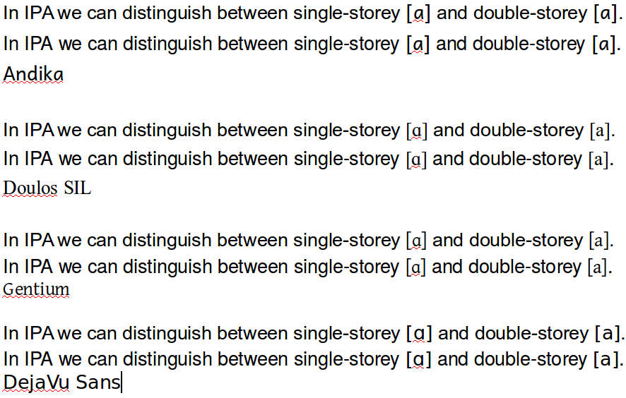
I guess Andika was put first, because it is a sans-serif font with a weight similar to Arial/Helvetica, our main text font (until we get our own design, which should be quite soon). Compare

compare fonts

The first line is Arial and the second line TeX Gyre Heros (to emulate Helvetica, which I don't have on this machine).

I don't think we can blame the designers of Andika, because the "double-storey" a (U+0061 LATIN SMALL LETTER A) isn't specified to be double-storey, although many fonts do use a double-storey a. Moreover, the "single-storey" ɑ is actually not an A, but U+0251 LATIN SMALL LETTER ALPHA (whatever a Latin alpha is supposed to be...).

I would support a change that helps distinguish a and ɑ, but (hopefully) by the time this would get implemented, we already have a new body font. I assume the new design will use a sans-serif font (to pair with a Japanese Gothic font), but maybe it will be lighter, so that pairing with Gentium might actually look reasonably good:

open sans and gentium
This is Open Sans (as used on http://graphicdesign.stackexchange.com/https://graphicdesign.stackexchange.com/)

I guess Andika was put first, because it is a sans-serif font with a weight similar to Arial/Helvetica, our main text font (until we get our own design, which should be quite soon). Compare

compare fonts

The first line is Arial and the second line TeX Gyre Heros (to emulate Helvetica, which I don't have on this machine).

I don't think we can blame the designers of Andika, because the "double-storey" a (U+0061 LATIN SMALL LETTER A) isn't specified to be double-storey, although many fonts do use a double-storey a. Moreover, the "single-storey" ɑ is actually not an A, but U+0251 LATIN SMALL LETTER ALPHA (whatever a Latin alpha is supposed to be...).

I would support a change that helps distinguish a and ɑ, but (hopefully) by the time this would get implemented, we already have a new body font. I assume the new design will use a sans-serif font (to pair with a Japanese Gothic font), but maybe it will be lighter, so that pairing with Gentium might actually look reasonably good:

open sans and gentium
This is Open Sans (as used on http://graphicdesign.stackexchange.com/)

I guess Andika was put first, because it is a sans-serif font with a weight similar to Arial/Helvetica, our main text font (until we get our own design, which should be quite soon). Compare

compare fonts

The first line is Arial and the second line TeX Gyre Heros (to emulate Helvetica, which I don't have on this machine).

I don't think we can blame the designers of Andika, because the "double-storey" a (U+0061 LATIN SMALL LETTER A) isn't specified to be double-storey, although many fonts do use a double-storey a. Moreover, the "single-storey" ɑ is actually not an A, but U+0251 LATIN SMALL LETTER ALPHA (whatever a Latin alpha is supposed to be...).

I would support a change that helps distinguish a and ɑ, but (hopefully) by the time this would get implemented, we already have a new body font. I assume the new design will use a sans-serif font (to pair with a Japanese Gothic font), but maybe it will be lighter, so that pairing with Gentium might actually look reasonably good:

open sans and gentium
This is Open Sans (as used on https://graphicdesign.stackexchange.com/)

Source Link
Earthliŋ Mod
  • 48.4k
  • 15
  • 29

I guess Andika was put first, because it is a sans-serif font with a weight similar to Arial/Helvetica, our main text font (until we get our own design, which should be quite soon). Compare

compare fonts

The first line is Arial and the second line TeX Gyre Heros (to emulate Helvetica, which I don't have on this machine).

I don't think we can blame the designers of Andika, because the "double-storey" a (U+0061 LATIN SMALL LETTER A) isn't specified to be double-storey, although many fonts do use a double-storey a. Moreover, the "single-storey" ɑ is actually not an A, but U+0251 LATIN SMALL LETTER ALPHA (whatever a Latin alpha is supposed to be...).

I would support a change that helps distinguish a and ɑ, but (hopefully) by the time this would get implemented, we already have a new body font. I assume the new design will use a sans-serif font (to pair with a Japanese Gothic font), but maybe it will be lighter, so that pairing with Gentium might actually look reasonably good:

open sans and gentium
This is Open Sans (as used on http://graphicdesign.stackexchange.com/)