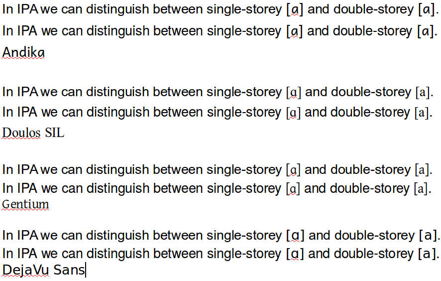
3

眠いので日本語で失礼します。

問題

  • [​[a]] → [[a]]
  • [​[ɑ]] → [[ɑ]]

enter image description here
(Windows 10 64bit, Firefox での表示)

原因

.IPA {
    font-family: Andika, Doulos SIL, Gentium, GentiumAlt, Segoe UI, DejaVu Sans, Bitstream Vera Sans, TITUS Cyberbit Basic, Bitstream Cyberbit,Arial Unicode MS, Lucida Sans Unicode, Code2000,Hiragino Kaku Gothic Pro, Matrix Unicode, Chrysanthi Unicode;
}

Andika フォントは標準で a が single-storey になるようです。

Question: I need to distinguish between single-storey 'ɑ' and double storey 'a' in italic IPA text, but the font doesn't allow it.

Answer: This can be addressed using font features.

This overview explains what font features are and what each feature does. (The feature that will allow you to display an italic 'a' is number 1053 - Slant Italic Specials.)

This page explains how to activate font features in various applications/operating systems.

(http://scripts.sil.org/cms/scripts/page.php?item_id=ComplexRomanFontFAQ#0d5c43fd)

解決法?

  • Font feature を CSS あるいは JS でいじる(できる?)
  • Andika を指定からはずす(Gentium が一位の方がいいかも)
6
  • FWIW, my Linux system falls all the way back to DejaVu Sans, which doesn't seem to have this problem. Commented Apr 19, 2016 at 18:28
  • 1
    FWIW, I struggled for some time when making the decision for which fonts to use for IPA in the Furigana engine. I chose Andika because it was a sans-serif font, which I thought would be a good match for the site's sans-serif fonts; because I thought that SIL fonts were pretty good for IPA (although this may not be true looking in hindsight); because I thought Gentium's smaller size for the same em/px values made it harder to read; and because of a lack of consensus about which font should be used.
    – cypher
    Commented Apr 20, 2016 at 2:31
  • 1
    The best solution would be to use web fonts which have the proper IPA ranges (such as DejaVu Sans), especially considering the patchy support for these ranges in the various fonts installed by default on many OSes. However, the conclusion I had at the time was that they'd be quite large if including all IPA ranges, so I'm not sure what I should do at this stage. I'll need to have a think about it.
    – cypher
    Commented Apr 20, 2016 at 2:33
  • 1
    Haven't been able to activate those alternative characters with font-feature-settings CSS so far with Chrome/Firefox on Ubuntu, might have another try later on...
    – cypher
    Commented Apr 20, 2016 at 4:35
  • 1
    @DariusJahandarie It seems that I manually installed them on my PC quite a while ago, not really something to do with my OS. Commented Apr 20, 2016 at 5:21
  • @cypher Thanks for taking the trouble. They're supposed to support it by the catalog spec caniuse.com/#feat=font-feature, but maybe have something missing... btw Andika itself is a "literacy-education" font that isn't dedicated for technical usage. Commented Apr 20, 2016 at 5:26

2 Answers 2

2

I guess Andika was put first, because it is a sans-serif font with a weight similar to Arial/Helvetica, our main text font (until we get our own design, which should be quite soon). Compare

compare fonts

The first line is Arial and the second line TeX Gyre Heros (to emulate Helvetica, which I don't have on this machine).

I don't think we can blame the designers of Andika, because the "double-storey" a (U+0061 LATIN SMALL LETTER A) isn't specified to be double-storey, although many fonts do use a double-storey a. Moreover, the "single-storey" ɑ is actually not an A, but U+0251 LATIN SMALL LETTER ALPHA (whatever a Latin alpha is supposed to be...).

I would support a change that helps distinguish a and ɑ, but (hopefully) by the time this would get implemented, we already have a new body font. I assume the new design will use a sans-serif font (to pair with a Japanese Gothic font), but maybe it will be lighter, so that pairing with Gentium might actually look reasonably good:

open sans and gentium
This is Open Sans (as used on https://graphicdesign.stackexchange.com/)

4
  • Oh, it's off the track, but have you been notified what the new design would be like? I'm so interested! Commented Apr 20, 2016 at 5:29
  • As for the Latin "Alpha", it's the grab bag of "different from ordinary a" letters in many writing systems, that written as script a, or alpha-shaped a, or script a that looks like alpha. So it's okay that IPA open back unrounded vowel uses this code point. Commented Apr 20, 2016 at 5:40
  • @broccoliforest No, we haven't been notified of anything. But a couple of months ago we were next in line after ELL, and they just got their new design.
    – Earthliŋ Mod
    Commented Apr 20, 2016 at 7:53
  • I'm in favor of making Doulos or Gentium our first choice :-)
    – user1478
    Commented Apr 22, 2016 at 15:28
2

On the feasibility of font-feature-settings solution

As I tried with the latest version (ver 5.000 at the moment) of Andika and other SIL fonts on Firefox 45.0.2, I have found the font-feature-settings property does work but has its own limitation due to font implementations.

According to the documentation attached to the fonts, SIL's Latin fonts have a "literacy alternate" feature that toggles printed or script a and g shapes to be displayed. The switch is represented by litr in Graphite (SIL's own font feature set) ID and ss01 in OpenType ID.

You can set a stylesheet rule:

.IPA {
  font-feature-settings: "litr" 0;
}

to disable handwriting variation in Andika.

enter image description here

However, the Graphite features are only supported on Firefox among major browsers (and even on the latest version of FF, it is temporarily disabled by default due to security concern, they say). Therefore, in order to apply the same effect on other browsers, you must use OpenType equivalent,

.IPA {
  font-feature-settings: "ss01" 1;
}

But the problem is, if you flag the feature when Graphite is disabled, the non-default shape seems always to be used, that means it shows you double-story a for Andika but single-story a for all other SIL fonts in turn. So far, I'm not sure if it's a technical restriction or a bug.

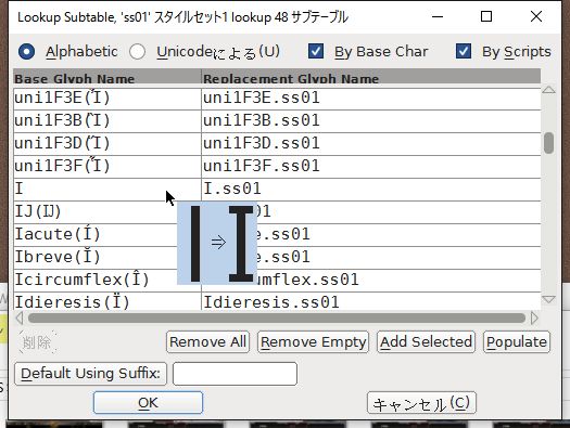
Another concern is it may have unwanted side effects on other fonts, since ss01 is a vendor-specified (i.e. private use) slot that allows custom use. For example, Segoe UI actually assigns some stylistic variations to it.

enter image description here

As for Google Chrome..., well it didn't recognize SIL fonts other than Charis SIL and Doulos SIL :D

You must log in to answer this question.

Not the answer you're looking for? Browse other questions tagged .