7

As a follow-up to Do we really need ruby characters all the time?, I think there could be some discussion in regards to the rendering of the Furigana engine:

  1. How the clutter of the Furigana could be reduced, while still allowing its useful functionality.
  2. How to balance Furigana-related hacks, and weighing up whether to always use browser-native ruby rendering, even if the #1 goal of reducing clutter would be adversely impacted.

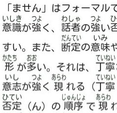
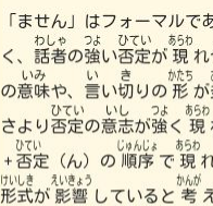
I believe the goal of reducing clutter could be substantially achieved by adding an option to display Furigana under rather than over the text. In fact, I think it may be a good idea to make such an option the default Furigana mode for this site.

As has been mentioned in the linked post above, eyes tend to be attracted by the ruby more than by the character when the Furigana is above the text, but if it's under it, I believe it's less intrusive and allows one to focus on the main Kanji before focusing on the Ruby (screenshot examples below).

The state of Webkit/Blink Ruby:

Webkit/Blink (as used in Opera, Chrome+Safari) all support Furigana natively, both under and over the text, and seem to render it quite well.

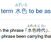
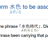
Chromium Version 47.0.2526.73:

enter image description here enter image description here

The state of Firefox Ruby:

Firefox now has native support for ruby, both under and over the text, but I personally don't like its rendering. It renders the Furigana quite far apart from from the text with a lot of padding. It doesn't seem there's currently anything that can be done about this, in CSS or otherwise.

I believe this would considerably increase the clutter on the site to the point where it would be worse to use native Firefox ruby than the present hacks.

Firefox native ruby rendering:

Firefox native Ruby Firefox native Ruby

Firefox "hack" ruby rendering using CSS tables:

enter image description here enter image description here

One thing that's interesting is that if the Furigana is under the text rather than over it in the "hack" mode, it seems to cease having as many vertical alignment issues, and removes the need for calculation hacks that are required when Furigana is over the text in hack mode.

The state of Internet Explorer Ruby:

IE has reasonable support for Furigana over text, but does not, AFAIK, support Furigana under text natively. It would therefore likely be necessary to use the "hack" CSS table rendering if rendering Furigana under the text.

IE 11 ("hack" CSS tables bottom-aligned Furigana above, native top-aligned Furigana below):

enter image description here

In my opinion, it might be better even in this browser to use the Furigana rendering below the text with the "hacks", as it seems to render OK (for me at least).


How does everyone about feel about this. Should we use native Furigana rendering in Firefox even with the spacing?

Should we keep the current behaviour of displaying the Furigana above the text, or should we make the default rendering mode Furigana below text (even in IE)?

12
  • I support this as an option, but I'd like to keep our default of furigana over text, personally. It might seem silly, but I've actually written my answers intentionally with the current furigana positioning in mind.
    – user1478
    Commented Dec 17, 2015 at 8:25
  • I might support making furigana very slightly smaller so they push words apart less often.
    – user1478
    Commented Dec 17, 2015 at 8:28
  • By the way, I've noticed that the furigana preferences for main and meta are separate. Is this avoidable?
    – user1478
    Commented Dec 17, 2015 at 8:29
  • 2
    In reference to your first 2 comments, I added (yet more) hacks to shrink Furigana to fit within the confines of the Kanji using CSS transforms. It actually looks much better than I was expecting (screenshot), and I think works better with top-aligned Furigana than bottom, so I might have to reverse my previous position of favouring bottom alignment...not sure whether I should edit the q or post an answer with my revised view, maybe the latter.
    – cypher
    Commented Dec 17, 2015 at 11:58
  • Unfortunately, I don't think it is possible to have the same preferences for main and meta, unless using <iframe> cross-domain communication hacks, which I think SE might not be happy with. Meta/main are different domain names, and there are security restrictions on localStorage in such circumstances.
    – cypher
    Commented Dec 17, 2015 at 12:05
  • @cypher The CSS transforms are beautiful. This is great. My only concern is what happens in pathological cases, like 志{こころざし}. Commented Dec 19, 2015 at 19:19
  • 1
    @DariusJahandarie currently, when the default "shrink text in moderation" option is selected, the Furigana will shrink to be at most 67% of the original (screenshot). Let me know if you feel that's too much.
    – cypher
    Commented Dec 20, 2015 at 7:14
  • Is there anything than can be done about the mobile version?
    – blutorange
    Commented Dec 20, 2015 at 8:40
  • @blutorange the mobile (web, I don't know about iPhone/Android app) version should theoretically be supported by the script as it is now. I've asked a few times for it to be added to the mobile site. I don't know why SE haven't added the script to it, whether it was just an oversight or whether they have another reason - you'd have to ask them.
    – cypher
    Commented Dec 20, 2015 at 8:52
  • That 67% limit seems good to me! Though I wonder what advice typesetting pros like @naruto would give on furigana. Commented Dec 20, 2015 at 19:33
  • w3.org/TR/2012/NOTE-jlreq-20120403/… seems relevant, but doesn't discuss compression... Commented Dec 20, 2015 at 21:17
  • @DariusJahandarie That's weird. We do have needs for compressed ruby like this (I can't read the second line though :D ) Commented Dec 23, 2015 at 8:32

2 Answers 2

2

As has been mentioned in my comment, I'm no longer in support of making bottom-aligned Furigana the default. I think that it is more usual to have Furigana top-aligned, and after adding font shrinking I believe the original goal of reducing the visual impact of Furigana will be achieved to a large degree.

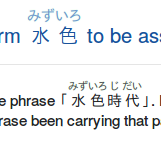
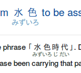
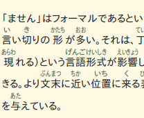
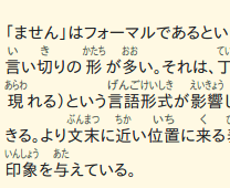
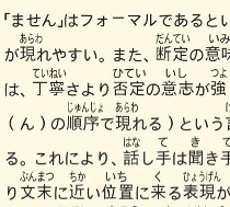
Comparison of top and bottom-aligned Furigana, with and without shrinking:

  • With shrinking:
    enter image description here      enter image description here
  • Without shrinking:
    enter image description here      enter image description here

There still will be the option to use bottom-aligned Furigana for people who would like to use it.


I think that, on balance and some investigation, that it would actually considerably reduce the number of bugs and inconsistencies between OSes/devices/browsers/fonts etc if "native" Furigana was never used, and there's one set of code to maintain. As it is right now, all the three major browsers have wildly differing implementations of ruby, and their implementations have issues and bugs which need to be worked around for each.

After some experimentation, I've found that using inline-block with relative positioning seems to be reasonably consistent and probably less buggy overall. This implementation may have some vertical alignment issues in rare cases, but it seems pretty good, and much less likely to be a problem than the current Firefox vertical-align hacks. Here's some screenshots of various OSes and browsers with the new inline-block rendering:

  • IE11/Firefox 43.0 Ubuntu 14.04:
    enter image description here enter image description here
  • Chromium 47.0.2526.73 Ubuntu/Chrome LG G Pad 8.3 main:
    enter image description here enter image description here
  • Chrome htc desire 610 mobile/Chrome htc desire 610 main:
    enter image description here enter image description here

As can be seen in the screenshots, there are still some issues with the size of Furigana on Android/Chrome, as there were previously with native ruby rendering. I'm setting the font-size to be size of the surrounding text to try to combat the issue at http://chat.stackexchange.com/transcript/511?m=17474056, but I think that the translation between pixels and actual rendered font size might be resulting in calculation problems at a browser or font rendering level. I'm not sure what I can do about this at this point. ((should be mostly fixed))


There have been a number of times I've noticed people not finding the Furigana options, so I've made the link in the footer have a dashed border, made the text bolded, and added a down arrow to try to make sure people who want to alter/not use Furigana rendering know that the relevant options are there.

I've also renamed "Furigana options" -> "Japanese options" as the options control more than just Furigana: they also allow changing Japanese fonts or turn off the Japanese extensions entirely. I'm aware that "Japanese options" is not strictly speaking correct, and would technically be better as "Japanese javascript extension options" or something, however space is limited.

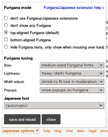
New options have also been added under a heading "Furigana fonts" to control the impact of Furigana:

  • Size: can change the font size of Furigana
  • Lightness: can change how much the Furigana's text colour is lightened by relative to the text, and
  • Width adjust: can turn on/off shrinking of Furigana to fit the corresponding text, and allow changing of the maximum degree Furigana is allowed to be shrunk by
  • Popups: can choose whether to have enlarged popup readings when mousing over Furigana:

enter image description here


Keeping in mind that many users who use "hide furigana texts, only show when mousing over kanji" do it to reduce visual effect, I have also made the underline a lighter 2px dotted line, rather than a 1px dashed line. A before/after comparison:

  • Before:
    enter image description here

  • After:
    enter image description here

If anyone thinks the new underlining is too hard to see, or has any other feedback on the changes in this post in general, please let me know.


UPDATE: After using the new version for a while, I think that Furigana is frequently hard to read when it's lighter, so I think it's best to leave it on the dark mode by default. Lighter Furigana might be better for when it's more heavily used, but I don't think Furigana should necessarily be used as much as in the examples above anyway, and when used for defining special readings/introducing words etc it's important for it to be readable.

I've also added popups to ruby, as it sometimes can be difficult to distinguish 濁点{だくてん}:

enter image description here

11
  • 1
    The じ looks a little bit higher than the other characters.
    – user1478
    Commented Dec 20, 2015 at 12:19
  • @snailboat thanks for pointing that out. That, and other Firefox vertical align issues, should be fixed (or greatly reduced) now.
    – cypher
    Commented Dec 21, 2015 at 3:40
  • Looks great! :-)
    – user1478
    Commented Dec 21, 2015 at 6:10
  • Great job! I think the remaining place where furigana ends up being way too visually heavy is in long Japanese paragraphs that only have some furigana. E.g., the quote in this post. The few words with furigana end up sticking out ridiculously due to all the added whitespace. The usual typesetting practice here is to have a tall line-height (see same post with fixed line-height), but I can't think of an easy way to identify sections of text which are all Japanese and therefore should get the taller line-height. Commented Dec 25, 2015 at 21:56
  • @DariusJahandarie neither can I, so I've added a {{​pad}} directive which can explicitly make the nearest parent block element have a tall line-height (before and after)
    – cypher
    Commented Dec 26, 2015 at 22:50
  • @cypher Is that something we can put in an HTML comment so it doesn't show up for people without the furigana script?
    – user1478
    Commented Dec 27, 2015 at 0:53
  • @snailboat I'm afraid not - the SE markdown engine strips out comments entirely when it converts to HTML.
    – cypher
    Commented Dec 27, 2015 at 1:06
  • @cypher Nice, thanks! I suspect it won't get used very often, since not many people care enough about such minor formatting details to actively use a tag like that, but better than no solution at least. Commented Dec 27, 2015 at 2:10
  • @DariusJahandarie possibly not, but it's really difficult to figure out, even in entirely Japanese blocks of text, whether adding a bigger line-height will make things better or worse. For example, if the first line has Furigana but not the following line(s) I think it's better if you don't use the bigger line-height because the following lines will have unnecessary padding. I'll add something to the docs after the new version's live - they should be easier to find, and hopefully people who know about the syntax can edit other people's posts to add {{​pad}} when it's beneficial.
    – cypher
    Commented Dec 27, 2015 at 5:52
  • {{pad}} Now that we have support for furigana on mobile, we can use things like {{pad​}} without worrying about how they look without the script running. I had some ideas for ways to use the furigana engine before, like emphasis with [underline]{LLLLLLLLL} or [圏点]{﹅・﹅}, but I never used them because I was afraid they'd be incomprehensible on mobile. I'm excited! :-)
    – user1478
    Commented Jan 6, 2016 at 12:13
  • The mouseover does make using emphasis dots (like ) a bit weird, though.
    – user1478
    Commented Jan 6, 2016 at 12:20
2

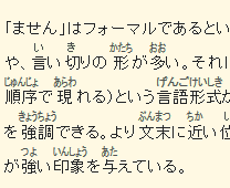
This is a test answer to check the Furigana changes are rendering acceptably.

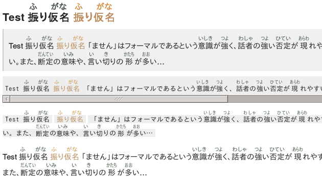
The test at the bottom of this answer currently looks like the following screenshot to me on Firefox 42.0/Ubuntu 14.04 (I've clipped the right of the image a bit so that it isn't scaled):

enter image description here

I've made it so that the text color of the Furigana is slightly lightened to reduce its impact.

I've also added a very light 0.12 opacity 1px green text-shadow halo so that it stands out just enough to be different, while (hopefully) not being too overt. It might look slightly different on some monitors, if anyone feels it's too strong etc please say so.


Test 振{ふ}り仮名{がな} 振{ふ}り仮名{がな}

Test 振{ふ}り仮名{がな} 振{ふ}り仮名{がな} 「ません」はフォーマルであるという意識【いしき】が強【つよ】く、話者【わしゃ】の強【つよ】い否定【ひてい】が現【あらわ】れやすい。また、断定【だんてい】の意味【いみ】や、言【い】い切【き】りの形【かたち】が多【おお】い…

Test 振{ふ}り仮名{がな} 振{ふ}り仮名{がな} 「ません」はフォーマルであるという意識【いしき】が強【つよ】く、話者【わしゃ】の強【つよ】い否定【ひてい】が現【あらわ】れやすい。また、断定【だんてい】の意味【いみ】や、言【い】い切【き】りの形【かたち】が多【おお】い…

Test 振{ふ}り仮名{がな} 振{ふ}り仮名{がな} 「ません」はフォーマルであるという意識【いしき】が強【つよ】く、話者【わしゃ】の強【つよ】い否定【ひてい】が現【あらわ】れやすい。また、断定【だんてい】の意味【いみ】や、言【い】い切【き】りの形【かたち】が多【おお】い…

Test 振{ふ}り仮名{がな} 振{ふ}り仮名{がな} 「ません」はフォーマルであるという意識【いしき】が強【つよ】く、話者【わしゃ】の強【つよ】い否定【ひてい】が現【あらわ】れやすい。また、断定【だんてい】の意味【いみ】や、言【い】い切【き】りの形【かたち】が多【おお】い…

Same tests with padding:

{{pad}}Test 振{ふ}り仮名{がな} 振{ふ}り仮名{がな} 「ません」はフォーマルであるという意識【いしき】が強【つよ】く、話者【わしゃ】の強【つよ】い否定【ひてい】が現【あらわ】れやすい。また、断定【だんてい】の意味【いみ】や、言【い】い切【き】りの形【かたち】が多【おお】い…

{{pad}}Test 振{ふ}り仮名{がな} 振{ふ}り仮名{がな} 「ません」はフォーマルであるという意識【いしき】が強【つよ】く、話者【わしゃ】の強【つよ】い否定【ひてい】が現【あらわ】れやすい。また、断定【だんてい】の意味【いみ】や、言【い】い切【き】りの形【かたち】が多【おお】い…

{{pad}}Test 振{ふ}り仮名{がな} 振{ふ}り仮名{がな} 「ません」はフォーマルであるという意識【いしき】が強【つよ】く、話者【わしゃ】の強【つよ】い否定【ひてい】が現【あらわ】れやすい。また、断定【だんてい】の意味【いみ】や、言【い】い切【き】りの形【かたち】が多【おお】い…

{{pad}}Test 振{ふ}り仮名{がな} 振{ふ}り仮名{がな} 「ません」はフォーマルであるという意識【いしき】が強【つよ】く、話者【わしゃ】の強【つよ】い否定【ひてい】が現【あらわ】れやすい。また、断定【だんてい】の意味【いみ】や、言【い】い切【き】りの形【かたち】が多【おお】い…

3
  • BTW, anyone can try the new engine (chrome/firefox) by using adblock plus to block //sstatic.net/js/third-party/japanese-l-u.js?v=9 (the version on JLSE); installing Greasemonkey(FF)/Tampermonkey(Chrome); then going to gist.github.com/cyphr/6536814, and clicking "Raw" in the top right.
    – cypher
    Commented Dec 17, 2015 at 0:13
  • That is still a bit distracting but I find it better than before. I adopt it. Thank you for your work. Commented Dec 17, 2015 at 2:28
  • @変幻出没 no problems. I've added an option to the Furigana settings in the bottom left corner of the screen to change the lightness of Furigana to make it less noticeable, but you might find you prefer the "only show when mousing over kanji" mode over Furigana. I'm certainly not going to suggest Furigana should be used as much as in this test, I'm just using this as an extreme example.
    – cypher
    Commented Dec 17, 2015 at 5:10

You must log in to answer this question.

Not the answer you're looking for? Browse other questions tagged .