8

Premise: My question is not about whether using Furigana or not. That topic has already been covered. My question is about how to display Furigana in order to make them easier to read.

I'm not sure this has being asked before, but if it's so, please let me know.

I was noticing that Furigana are very very small, sometimes impossible to read. So I had an idea: why not add the furigana to be shown when hovering?

Something like this (the translation is probably too much, so imagine it only with the hiragana for the reading):

enter image description here

Yes, it can be improved, but it's a good example of what would make Furigana much more readable, in my opinion, than that microscopic version we have now.

What are your opinions on this?

8
  • 3
    What'd happen on smart phones (such as iPhones)?
    – Golden Cuy
    Commented Dec 31, 2011 at 7:43
  • @AndrewGrimm Mine is not an imposition, but a signaling of a problem: Furigana are way too small to be read properly and without effort. They should make my reading smooth but instead I spend half of the time trying to read something small like a pixel. If, for example, the furigana would be made bigger by default, it would be an acceptable solution for me. Or also, we could make it so, both are available, I don't know... We are here discussing about it.
    – Alenanno
    Commented Dec 31, 2011 at 10:51
  • 1
    @AndrewGrimm On smart phones, the ruby is not rendered as ruby, and it only appears verbatim (without escapes) as \[食\]\{た\}べる, so probably there will not be any difference.
    – user458
    Commented Jan 1, 2012 at 0:00
  • @Alenanno you can actually already do this to a certain extent, if you select "options" in the bottom left of a given page, you can select "hide ruby texts, only show when hover on kanji". It's a problem as you can't know which Kanji have readings until you mouse over them though. I think that Kanji with Furigana on them should be underlined or highlighted in some way if that's to happen.
    – cypher
    Commented Jan 13, 2012 at 22:36
  • @cypher that's not a bad idea, actually. I think you're right. That way, it would be easy to locate them, but it should be something not dotted because I think that sooner or later the dotted underline will be implemented for the color blind people, so we should think of something alternative...
    – Alenanno
    Commented Jan 13, 2012 at 22:44
  • @Alenanno I think ideally it would be good if both happened - both fix the font size in Furigana mode and emphasize somehow in "hover on Kanji" mode. On my desktop at least, I'd probably enable hover mode if I was able to easily tell which Kanji had readings.
    – cypher
    Commented Jan 13, 2012 at 23:06
  • 1
    A hover to show furigana mode should be an option, just like the hide furigana option. The current behaviour has worked fine so far, so it should continue to be the default.
    – Questioner
    Commented Feb 1, 2012 at 12:36
  • @DaveMG If you are talking about the possibility to choose among the different options, I'm all for it! But will that be accepted by who takes care about such things?
    – Alenanno
    Commented Feb 1, 2012 at 12:39

3 Answers 3

1

That may be a good idea. It will keep the Japanese sentences look normal without the flood of furigana, and at the same time allow those who want to put lots of furigana (incorrectly) to do so.

One important note is that, if it is going to be done, the current implementation of ルビ should be replaced, and a new typing notation should not be introduced so that all furigana will uniformally appear that way. I suppose we don't want a mess of having both the ordinary furiganas and popup bubbles used in different (parts of the) page(s).

2
  • 1
    I was thinking of keeping exactly the same MarkUp to make the transition basically unnoticed and "smooth". The rules (already decided if I remember well) for adding the Furigana still apply to this. I mean, adding furigana to numbers would still be incorrect, albeit not "annoying". :)
    – Alenanno
    Commented Dec 30, 2011 at 19:54
  • 1
    I would welcome any method to make furigana less intrusive (or options to hide it). Depending on the browser it breaks in different ways and overuse is always distracting. Simply converting it to title attributes on a span (possible enabled as an option in user preferences) would suit me well for instance.
    – hurdsean
    Commented Jan 14, 2012 at 7:18
1

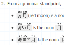
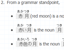
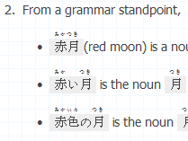
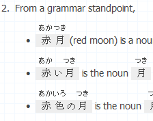
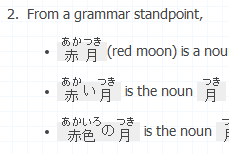
The user agent stylesheet in Google Chrome sets the font-size of rt tags to be 50% whereas Firefox sets it as 0.75em making Furigana much more readable in Firefox than Chrome in my opinion. In IE8 it's even tinier.

If e.g. rt {font-size: 0.75em;} was added to the CSS of this website I think it would make ruby much more readable and consistent across different browsers.

The other problem I've noticed is if Furigana is entered inside of a <code> tag e.g. 赤{あか}いろ, it makes the ruby really hard to read in IE8 because of the pixelation of the font which occurs, possibly due to IE's handling of the Japanese block ranges when a monospaced font is specified in stylesheets. For that reason, I think that something like rt {font-family: sans-serif;} might be worth considering (though I'm not sure whether that's a good idea at this point.)

I don't necessarily think that ruby should be eliminated from this site, but I think it would be good if everyone was able to view this site in more-or-less the same way no matter what browser or operating system they use.

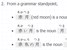
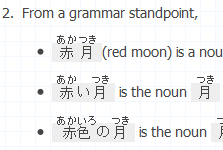
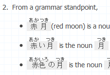
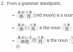
Edit: Pictures are worth 1000 words. The "after" screenshots have the style of rt {font-size: 0.75em; font-family: sans-serif;}. Taken on a Windows 7 install with ClearType turned on.

  • Chrome "16.0.912.63 m" before and after:

  • IE8 before, after and after without font-family: sans-serif:

  • Firefox 9.0.1 before and after:

  • Opera 11.60 before and after:

enter image description here enter image description here

1
  • Thank you for the insight. If Furigana on this site was big like that, it would be much more readable than it is right now. Because right now, every hiragana syllable is not bigger than a letter from my comment. :D
    – Alenanno
    Commented Dec 31, 2011 at 10:36
0

I would love if I could deactivate Furigana display in my user settings. If they are there, I am compelled to read them and will most certainly not bother to try to read the Kanji, which is really bad for learning. I have rikaikun installed for when I need the functionality, which would also conflict heavily with a furigana tooltip.

2
  • 2
    You can already do this, though it's a bit hard to find. Look at the bottom left corner of every page, you'll find an "options" link next to "about". Click it, check "hide ruby texts, only show when hover on kanji" and then click "save and reload".
    – cypher
    Commented Feb 1, 2012 at 12:15
  • Oh, thanks for pointing that out!
    – Kdansky
    Commented Feb 1, 2012 at 13:38

You must log in to answer this question.

Not the answer you're looking for? Browse other questions tagged .